Rutgers University
Scarlet Letters
- Wayfinding
- Sign Standards
- Branded Environments
- Education
A Unified Vision for a Growing Institution
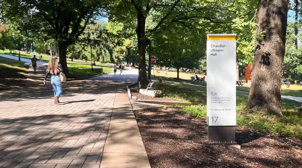
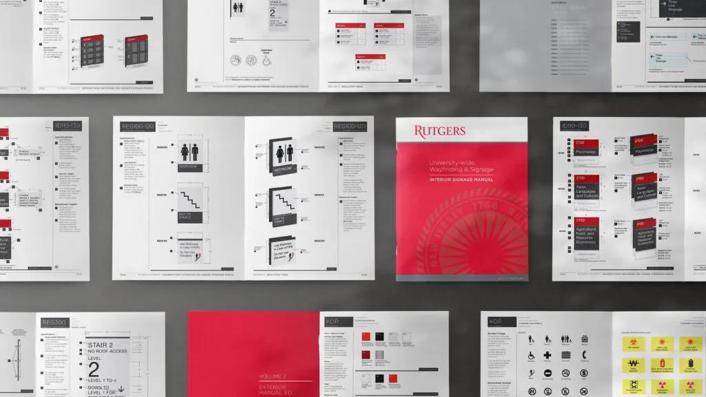
When Rutgers and UMDNJ came together and Rutgers stepped into its rank as a Top 10 public university, the campus experience had to match that momentum. Exit teamed up with Rutgers to look at seven campuses across the state and build an experience and exterior wayfinding system that is welcoming, clear, and feels unmistakably Rutgers. To lock that vision in for the long haul, we crafted a signage standards manual that gives Rutgers a straightforward playbook to carry this system forward with confidence and cohesion.

Navigating a Complex Campus Network
Rutgers is a highly complex system of campuses, made even more intricate through growth and expansion. The University is composed of three primary campuses and further complexity was added with the merger of UMDNJ. Establishing clear distinctions and connectivity across this expansive network was a central focus of the strategy.


A Flexible System Built to Scale
A simple, flexible, and cost‑effective kit‑of‑parts signage system was designed. The system encompasses more than 2,000 sign type variations to meet the needs of the diverse campuses and space types. Modular sign panels lock into extruded posts and can be easily updated as departments shift across campuses.

Rolling Out the Rutgers Brand
A critical component of the initiative was extending the Rutgers brand across newly acquired campuses. The wayfinding system was designed to deliver a unified look and feel that is unmistakably Rutgers. Core brand elements—including the wordmark, seal, and shield—are thoughtfully integrated throughout the system, reinforcing identity while supporting clear navigation.


Reimagining the Shield
As part of the program, Exit + J2 refreshed and reimagined the Rutgers shield. The goal was to create a simplified, modern coat of arms that felt approachable, memorable, and rich with narrative meaning. Each element was selected for its connection to the university’s history and values. The new identity and wayfinding system were unveiled during Rutgers’ 250th anniversary celebration in 2016.