Virtua Voorhees Hospital
Neighborhood Navigation
- Wayfinding
- Donor Recognition
- Health
A Neighborly Approach to Navigation
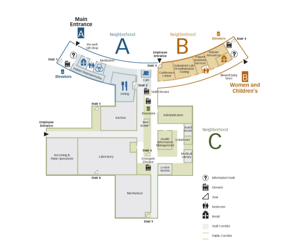
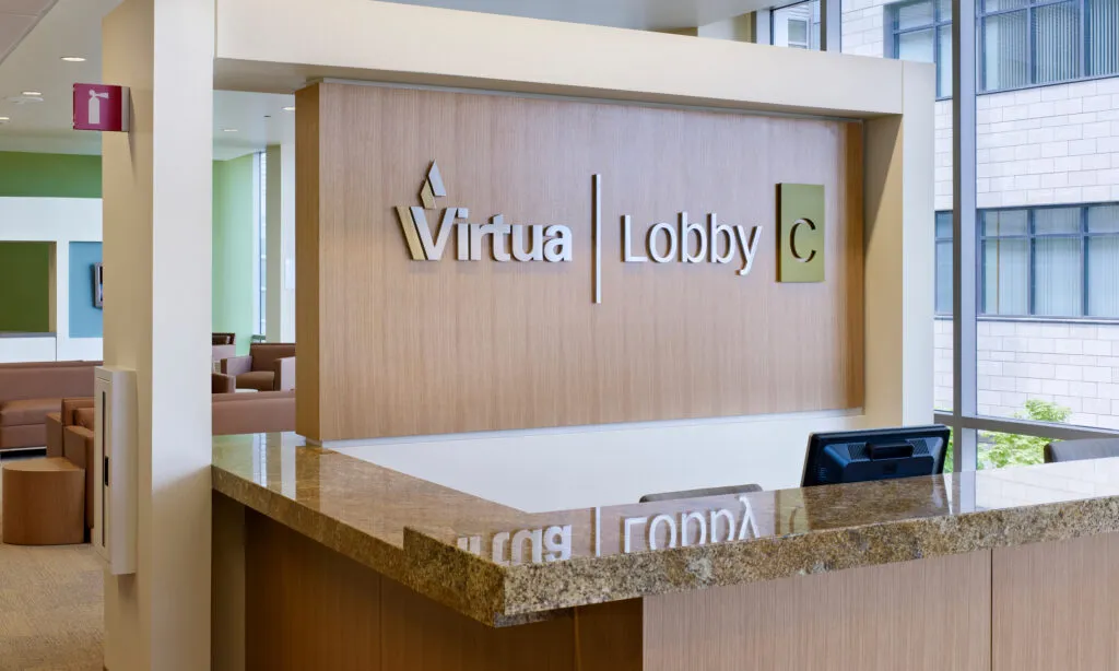
Responding to HGA’s master plan for the 680,000‑square‑foot Virtua Voorhees medical center, Exit created an inviting “neighborhood” navigation system to support the building’s autonomous entrance concept. We developed a comprehensive identity and wayfinding program centered on simplicity, clarity, and ease of movement throughout the campus. Our client’s trust—and our strong partnership with HGA—allowed us the creative freedom to design a welcoming, intuitive, and memorable navigation experience, complemented by a beautifully integrated donor wall that incorporates brand elements for a timeless result.


Simplifying Direction Giving
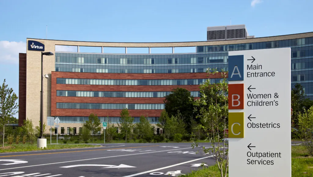
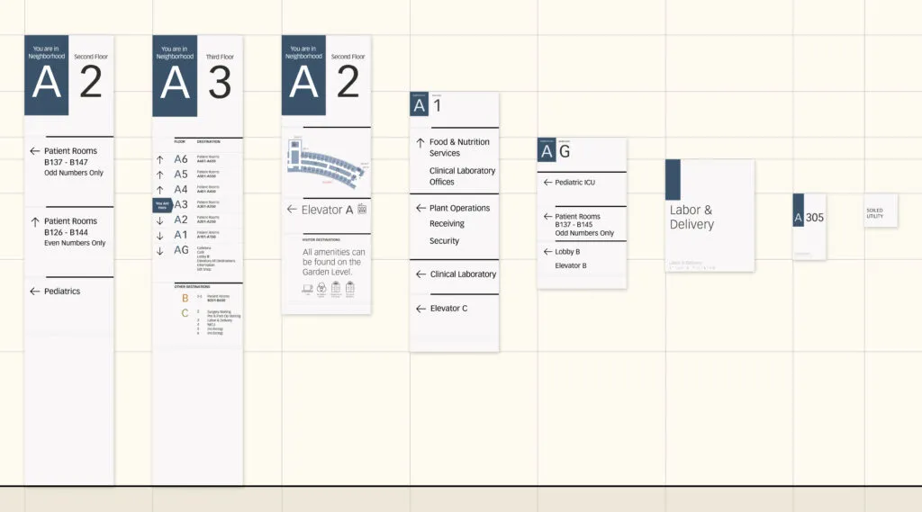
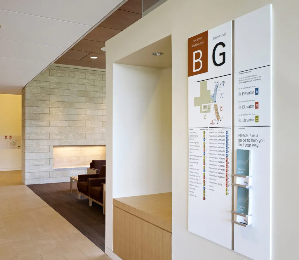
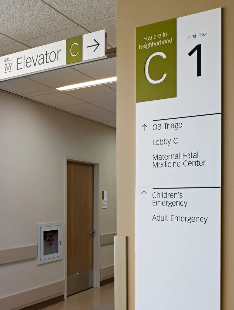
The “neighborhood” strategy softened the tone of the direction giving and is supported by alphanumeric methodology, similar to airports and familiar to everyone.
A Comprehensive Sign System
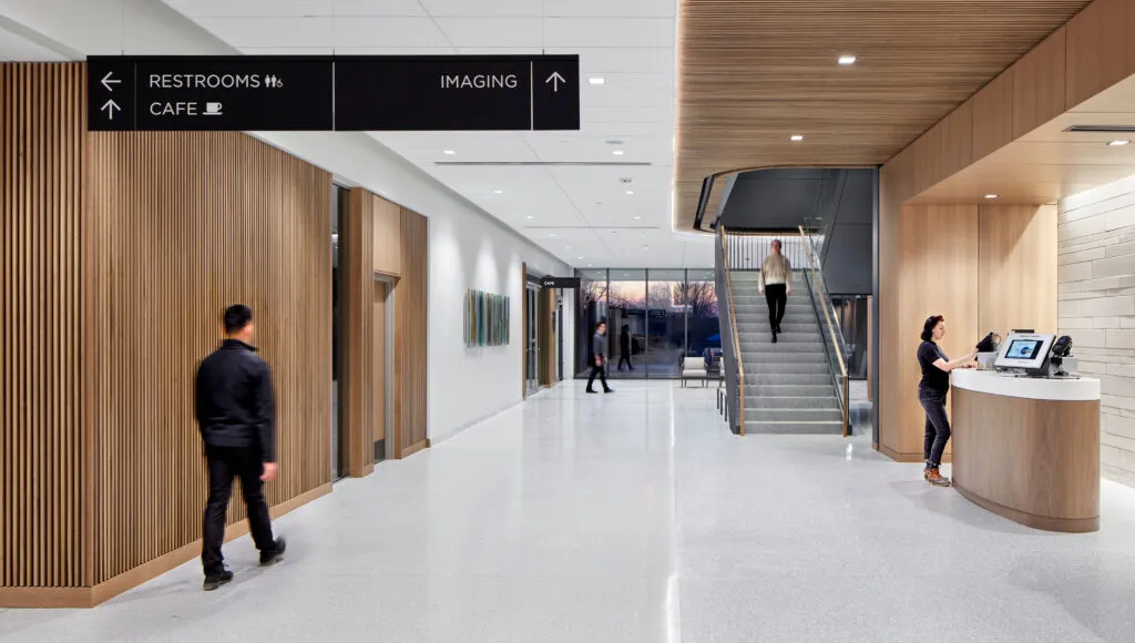
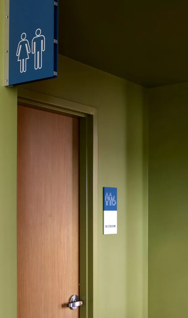
Comprehensive signage standards defined wayfinding, directional, orientation, and landmark signs. A versatile grid was built to maintain consistency yet still include the full range of messaging for this 3,000+ sign system.

Illuminating Recognition
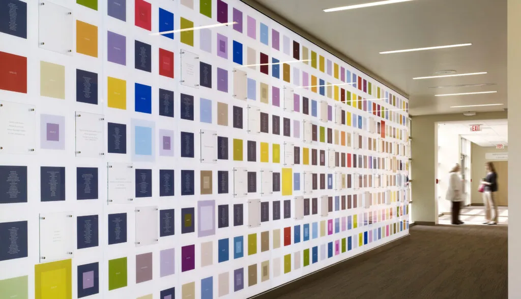
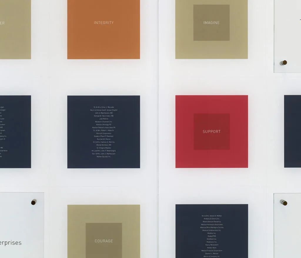
A striking illuminated glass donor wall recognizes those who made the construction possible and includes the overall color palette established during the wayfinding program design. Inspirational words chosen by Virtua staff are used to attract and inspire visitors and patients.
