Asian Arts Initiative
At the Center
- Wayfinding
- Branded Environments
- Brand Identity
- Arts + Culture
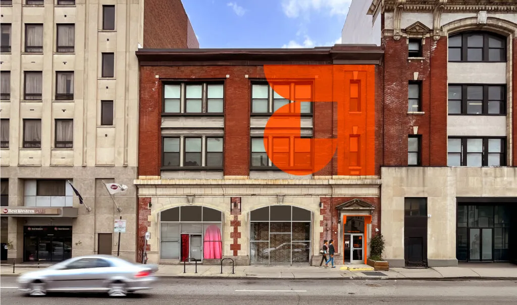
For over two decades, the Asian Arts Initiative has anchored Philadelphia’s Chinatown as a space where cultural expression meets social impact. Exit was tasked with reimagining how visitors experience this multidisciplinary hub, designing a wayfinding system and environmental graphics that would honor the organization’s deep community roots. With intentional spatial design, built on a cohesive brand foundation, we created an environment that tells the story of AAI’s work, guiding people through galleries, gathering spaces, and creative studios that reflect the vibrant, diverse community they serve.

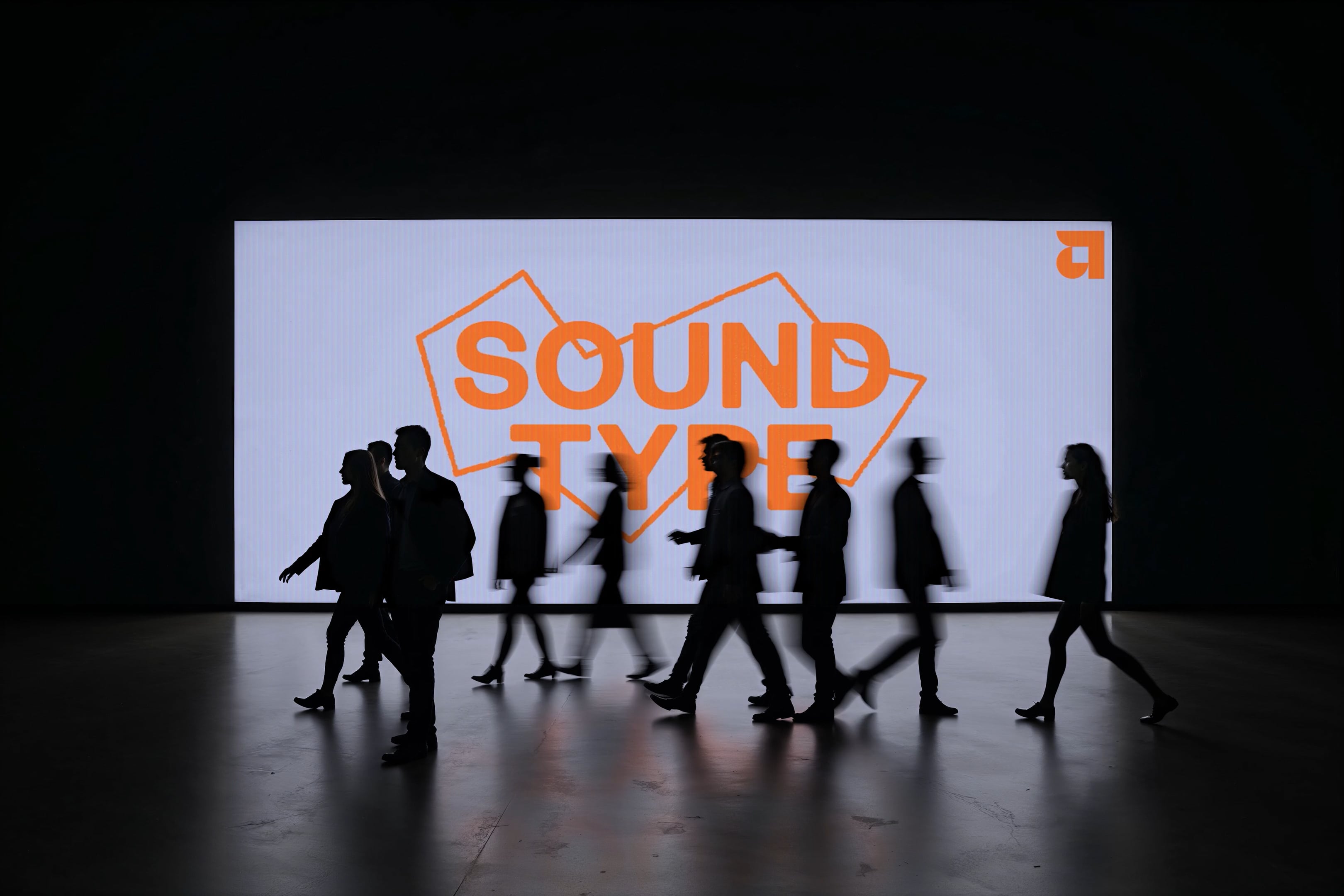
Pop in Place
Anyone that’s been to AAI knows it’s busting at the seams with vibrance and the unexpected. We embraced that through an exuberant, yet refined use of color across their spaces. The color pops created a clear and bold wayfinding experience that wrapped around corners and crawled up walls. They became canvases of color that activated the spaces, played well with existing murals, and identified floors, galleries, and work/public spaces.


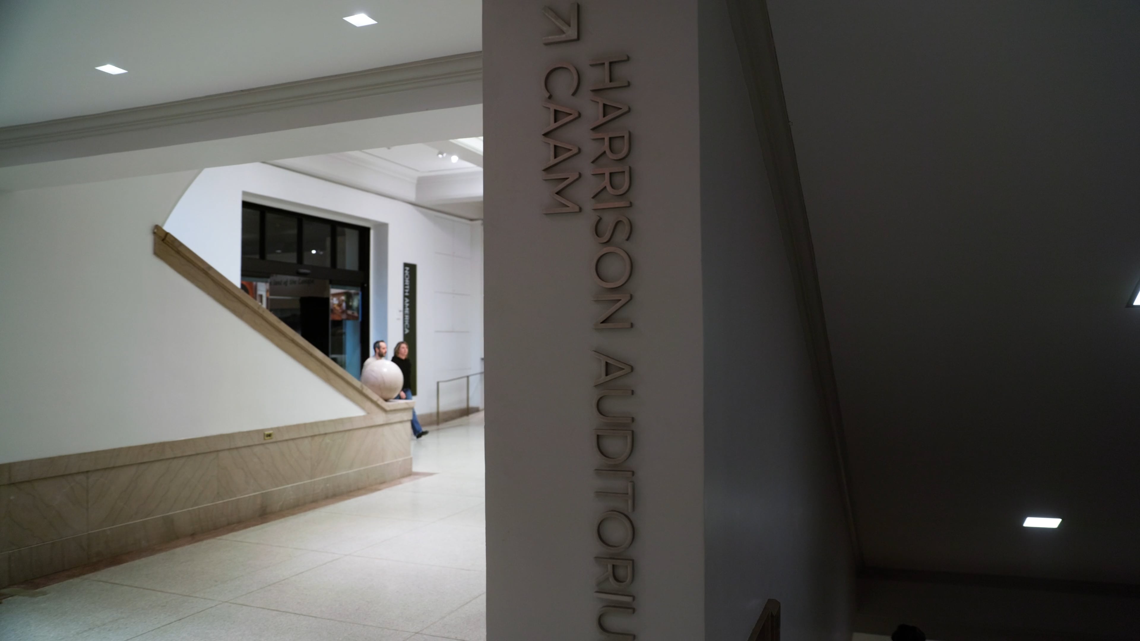
Directly There
A color-coded directory system welcomes all. The building is home to not only Asian Arts offices, galleries, and theaters—but various non-profit and arts-based tenants. To make sure every visitor gets where they’re going, we created a easy-to-update plaque system to started them on their colorful journey.


Pop and Go
We used the brand colors to differentiate floors, lead people along, and identify destinations. The color pop strategy allows AAI’s space to be draped in their brand and highly function at the same time. From the moment you approach the building, the brand and wayfinding story begins and beautifully leads you to your next stop via color pop.


Just Enough
The identity took shape across everything under the sun. We worked closely with the AAI team to pressure test the work in the early days, then they took the system and ran away with it.